I’ll be honest with you.
Wallpaper was never my first choice. Trying to find the perfect paint colour was hard enough — let alone a wallpaper design. Then having to figure out how to apply and eventually remove the wallpaper without messing everything up?
That’s a lot of pressure.
Not to mention: whenever I thought of wallpaper, I couldn’t help but picture my grandparents’ old kitchen. Hey, the food was great. But the decor? Let’s just say we have slightly different taste when it comes to interior design.
It always just kind of felt that wallpaper wasn’t for me.
Until now.
I recently learned that wallpaper is trending again — thanks in part to advancements in digital printing, new contemporary designs, and the ease of applying/removing peel-and-stick and nonwoven wallpapers. So, I figured I’d give it a shot using Roomvo’s visualizer, which allows shoppers to see what different wallpapers would look like in their actual homes before making a purchase.
And I have to say: I liked what I saw.
Step 1: Determine project goals
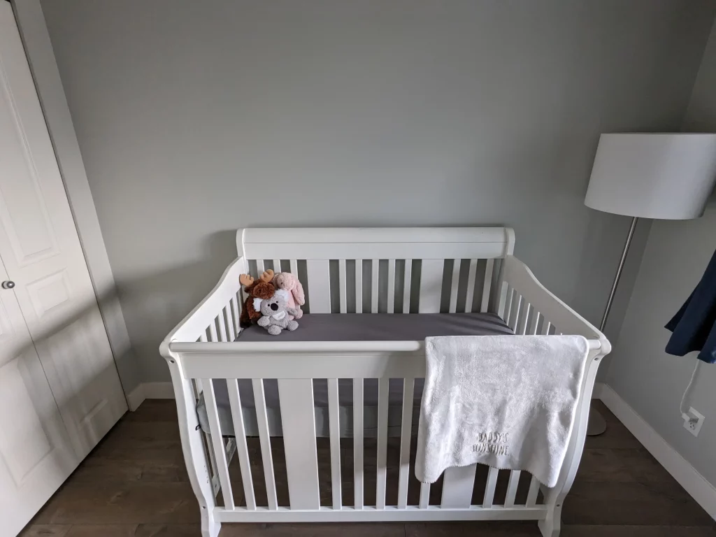
For a while, my wife and I have been thinking about how we want to decorate our baby’s nursery. So, this is the room I’m going to focus on.
Right now, the walls are a muted light grey, which is the same colour we have throughout most of our home. But we want this space to feel different. On the one hand, we want it to be lively and playful. On the other hand, we want to create a calming and peaceful environment, because, you know, the whole sleep thing.
That’s probably why we haven’t settled on a decision yet — we just keep going back and forth. Initially, we were debating between painting the walls and sticking on a wall decal. But now I’m curious to see how wallpaper might be able to transform the space.
To find out, I’m going to use the Roomvo-powered visualizer over at leading home decor and wallpaper brand, Andrew Martin.
Let’s get started.

Step 2: Upload photo in room visualizer
The Andrew Martin room visualizer can be accessed from their wallpaper category page, or from the “See it in your room” button on their individual wallpaper product pages. For the purposes of this exercise, I’m going directly to the visualizer.
Once the visualization window opens up, the first step is to either upload a photo of your space, or select one of the demo rooms provided. I’ve uploaded a photo of our nursery, since that’s where we want to see the wallpaper come to life to get a true sense of whether it’s the right fit for this room.
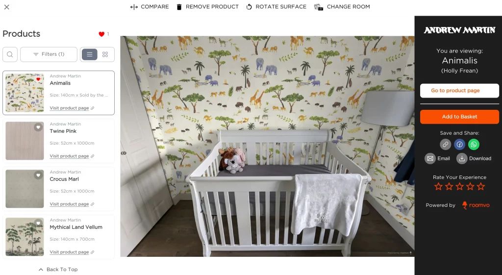
From there, the wallpaper catalog appears on the left panel. Now, I can simply browse through the wallpapers and, with a single click, apply the design of my choice onto any or all of the walls detected in the photo. To narrow down my search, I’m also going to add a filter specifying that I’m only interested in “paste-the-wall” wallpapers, as I understand those are easier and cleaner to deal with.
Step 3: Explore wallpaper designs
The first wallpaper that catches my eye is “Animalis.” It’s fun, vibrant, and as someone with roots in Africa, I love the safari theme. Overall, it just screams “nursery.”
Since the design is quite busy, I thought it might make more sense as a feature wall behind the crib. So, I unselected the other wall and only applied it there. But seeing it visualized, it felt a bit off in tandem with our current grey. As it turns out, I actually prefer how the room comes together with the wallpaper applied all around the room.
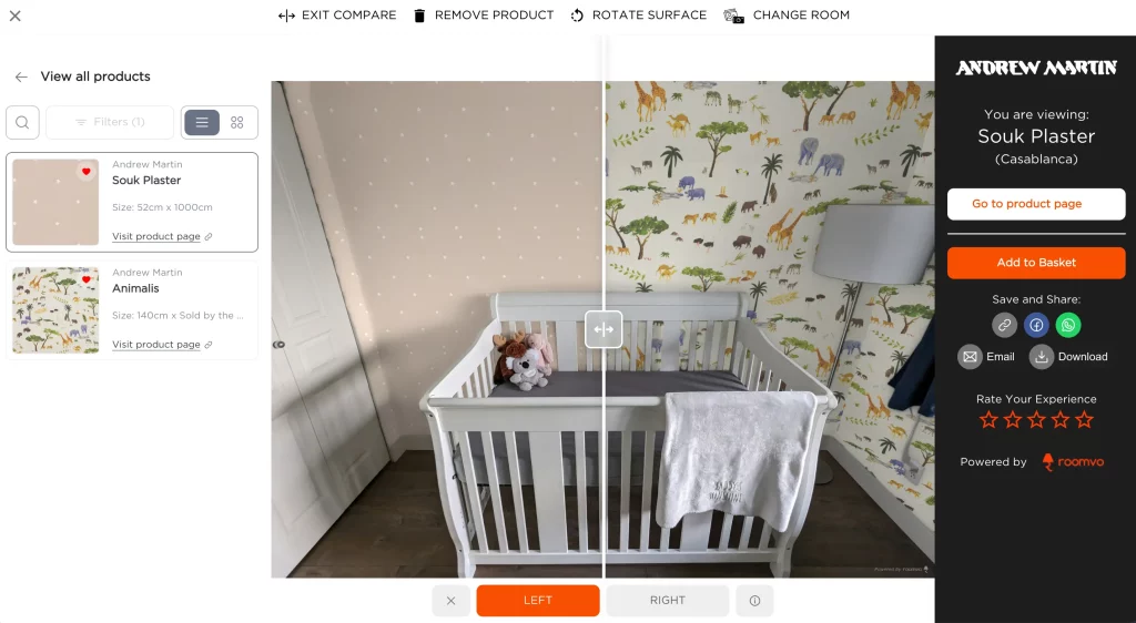
The other design I’m drawn to is “Souk Plaster.” With the dainty stars and blush background, this one fits into the “calming and peaceful” category. Being a more subtle option, I’d definitely want to apply this wallpaper across the entire room as well.
I mean, they both look great. And they both look real. Just look at the shadows on the walls, and how clean the wallpapers are applied between the crib rails and around the lamp. I was worried the rendering might lack detail, cover the wrong surfaces, or look a bit messy around the edges. But that’s definitely not the case.
It almost feels like I’m seeing the room in real life.

Step 4: Compare favourites and make decision
Now, I just have to make a decision.
Using the compare feature, I can view both wallpapers side-by-side, so I don’t have to go back and forth between the two renderings. This not only improves the user experience, but also makes it easier to see which product is best suited for the space.
Ultimately, I’ve landed on Souk Plaster.
Now that I can see the whole picture, I really like how the blush complements the white of the crib, lamp, and closet, as well as the brown of the floors. It kind of just feels like it’s all meant to go together, and I’m not sure I would have come to that realization without actually seeing it come together with the visualizer.
While definitely the more understated option, this wallpaper still adds a splash of colour and personality to the room while fostering that calming environment we desired.
I mean, who doesn’t love the idea of sleeping under the stars?

Step 5: Share or save rendering
So, I guess I was wrong about wallpaper.
There’s a design for pretty much any type of decor. And with new technology such as room visualization, the product selection process is quick and painless.
Finally, on the right panel of the visualization window, I can add the wallpaper to my basket, return to the product page, share the rendering on social media, email it to someone else, and/or download a copy onto my device. I’m going to opt for the latter, so I have it on hand when I make my case to the wife.
Wish me luck!
Written by:
-

Farhan Devji is a published author and content writer who’s written for some of Canada’s biggest newspapers and worked in communications/marketing for close to a decade. His new book, Alphonso Davies: A New Hope, was published in May 2023 with ECW Press.


